

MobileOne Healthcare Dedicated App
At-a-Glance
The design process for HealthOne began with foundational research to assess if there was a need for a one-stop shop for finding healthcare providers not under the umbrella of a single insurance plan. From here, I employed user-centered design principles in the process of developing a mobile app. As the contracted UX Design lead I ideated potential app designs, conducted usability studies with participants, iterated the app design, developed mockups and conducted final user research with the Hi-Fi prototypes and launched the final product.
Timeline
2 1/2 months
My Role
UX Designer
Platform
Figma
The Problem
Market research and background research indicate that users with health care insurance plans that are not limited to in-network providers have a difficult time finding, evaluating and choosing relevant healthcare providers. Most providers can only be identified by their associated insurance network platforms. The goal is to create an easy-to-use mobile app for users to find local healthcare providers from across insurance networks, and evaluate them to book appointments.
The Solution
As the sole UX designer I completed all tasks associated with the project, from market analysis, ideation, prototyping, usability research, through to hand-off for development. The result was a dedicated mobile app that can be downloaded and used as a one-stop shop for finding relevant healthcare providers and booking appointments.
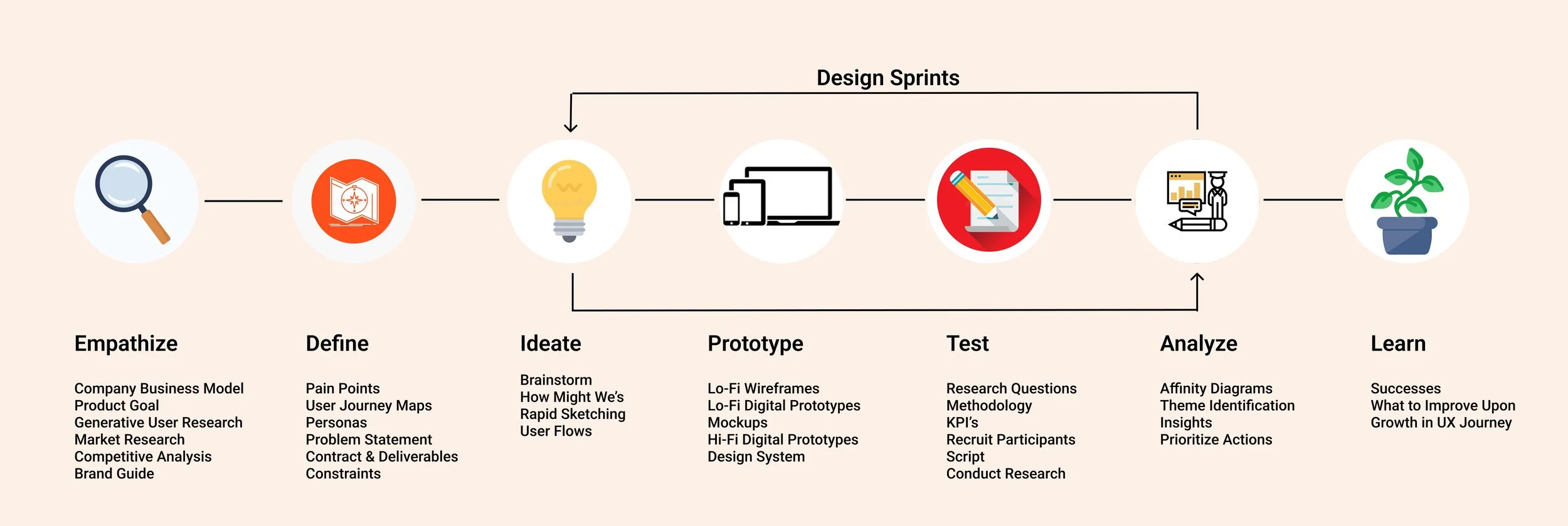
Process
Personas

User Journey

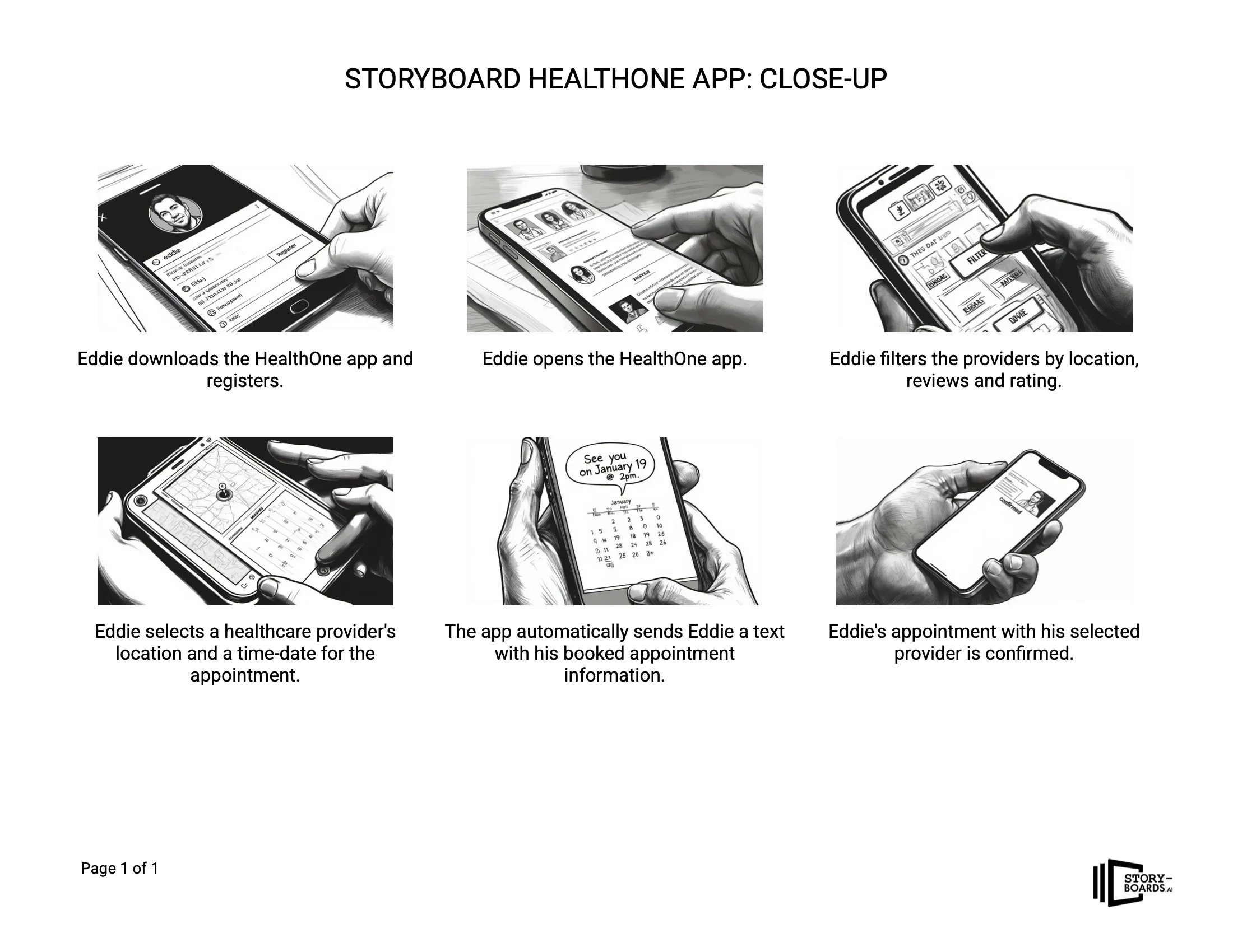
Storyboards
I used a gen-AI tool to develop some graphic storyboards to better understand the big-picture and close-up contexts of the app and how it could solve user needs.

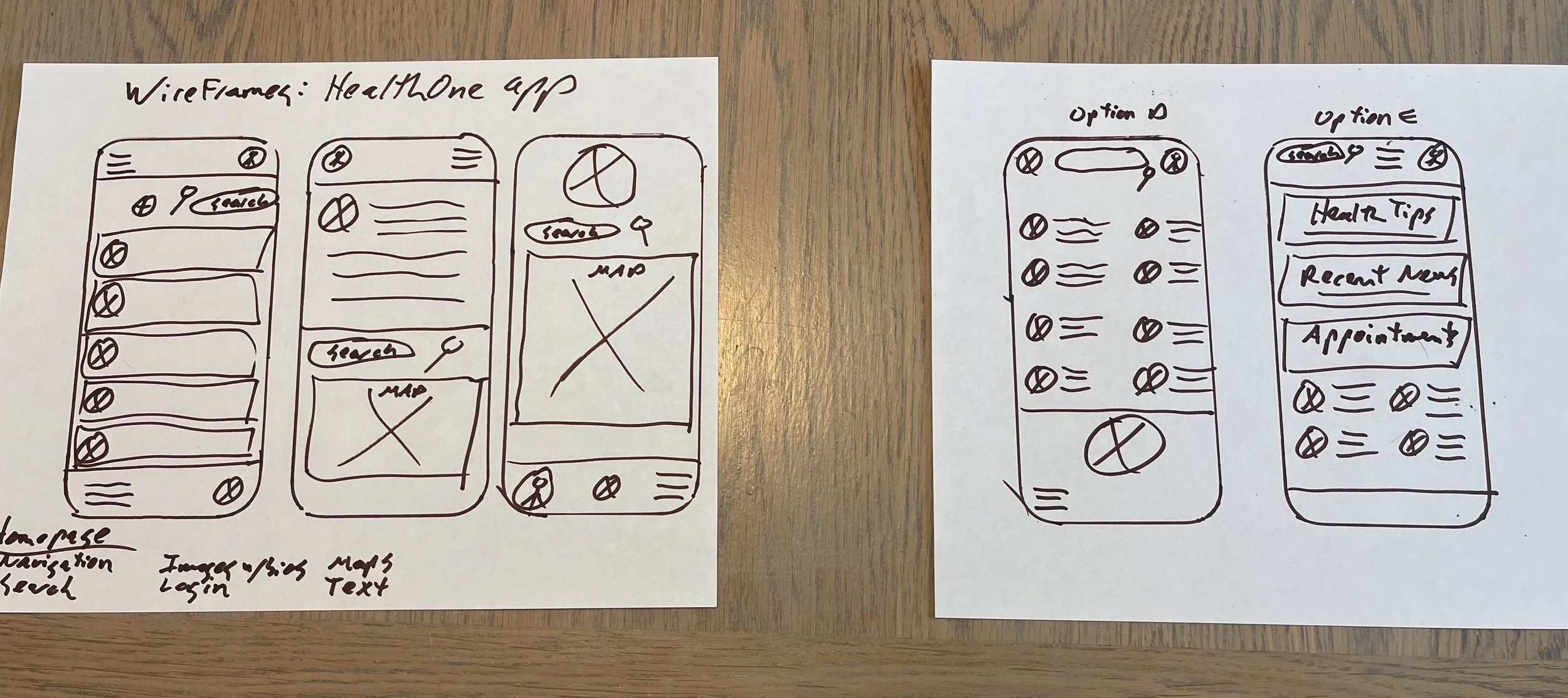
Ideate on Paper
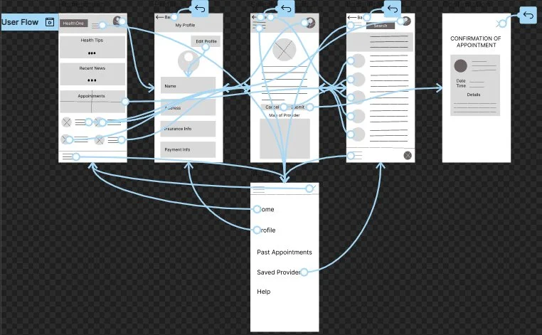
The process below begins with brainstorming, How Might We’s (HMWs), “crazy eights” sketches of wireframes on paper, then moves to digital wireframes in Figma, mockups and finally hi-fi prototypes. Throughout, I focus on how to best solve the needs of the users.
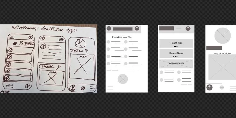
To Digital Wireframes
I brought my paper ideas into Figma to create digital wireframes and then interactive lo-fi prototypes for initial user testing.
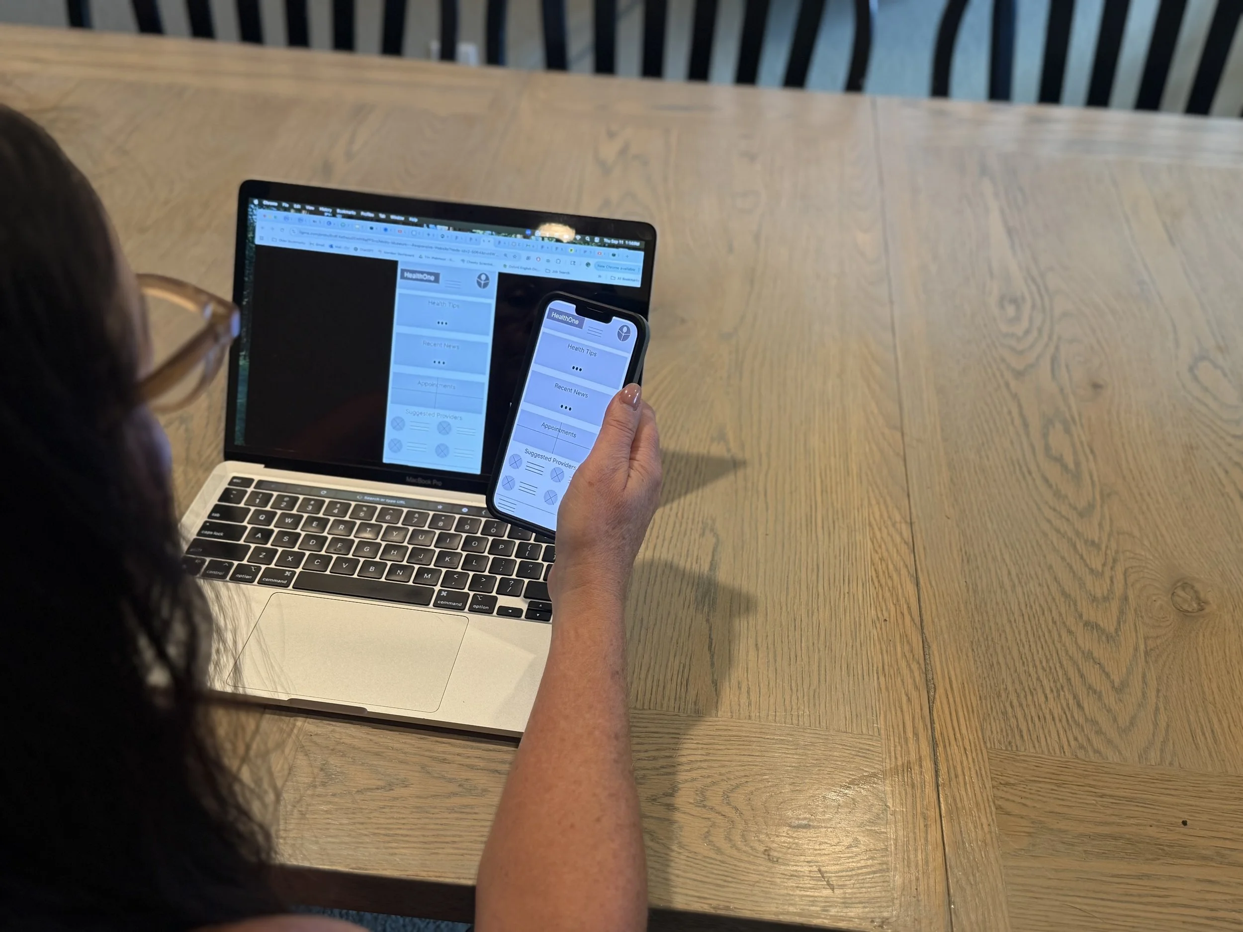
Lo-fi Prototypes
User Testing
I recruited four participants for initial user testing, two men and two women ages 16-51. I conducted moderated testing and used video screen recording for analysis. I put the responses into buckets using Affinity Diagrams to identify key themes and develop actionable insights.
Iteration
Based on the user testing, I incorporated three major insights and iterated on the design.
Design Changes
I made three major changes based on user feedback.
Calendar for dates/times
A new screen to review confirmation before booking
A clear list of suggested providers before selecting one to book
Design System

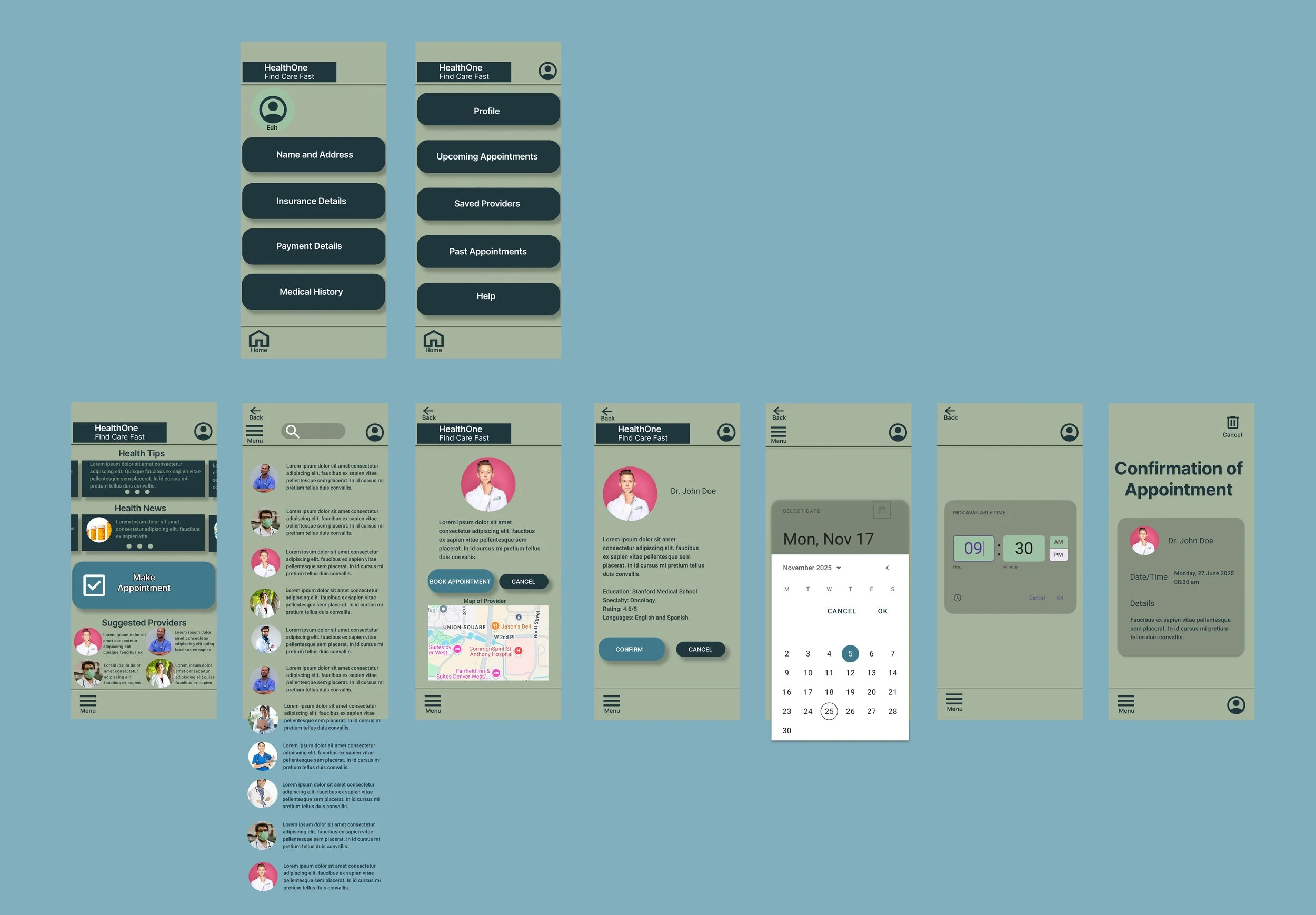
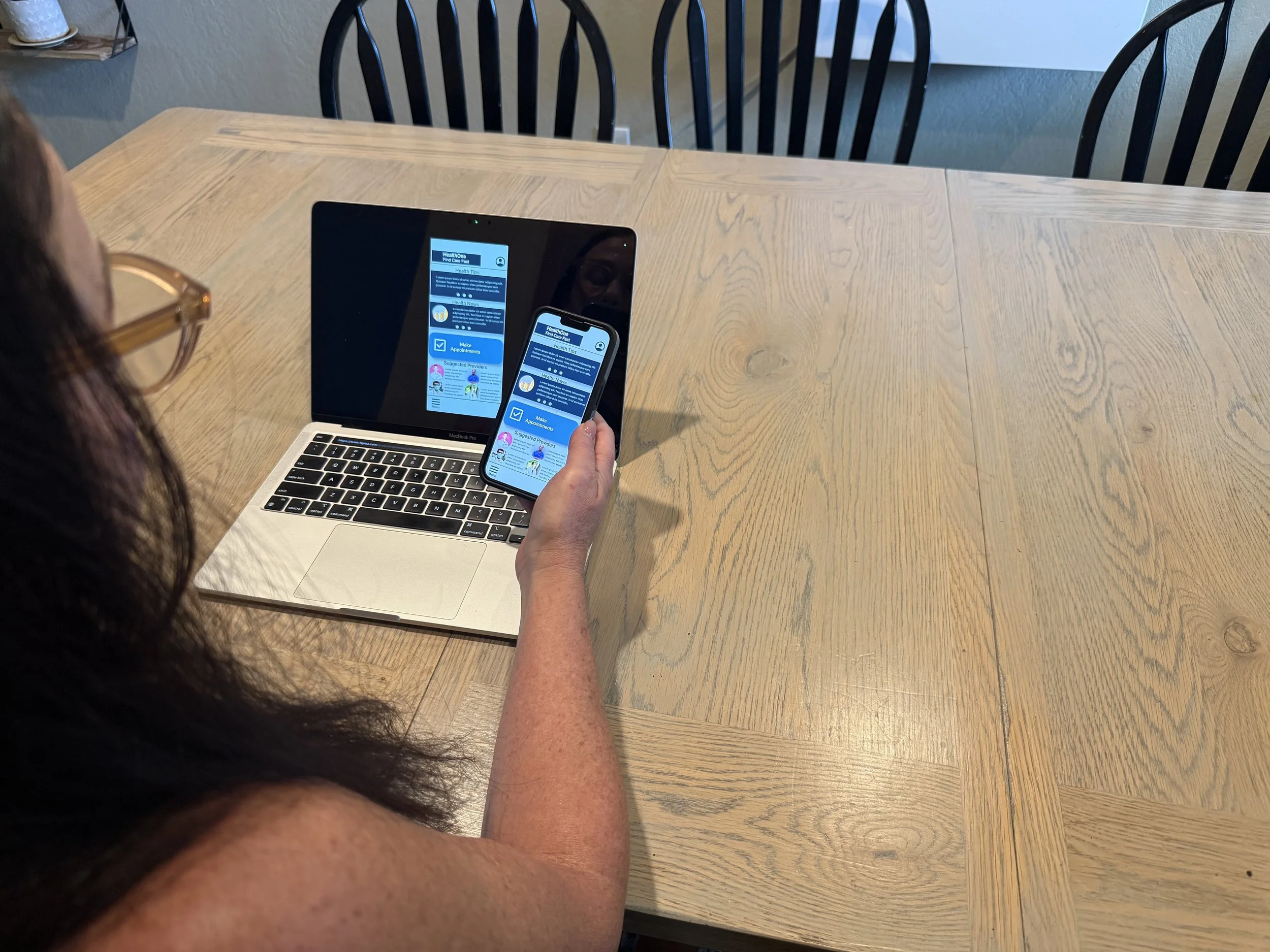
Hi-fi Prototypes
Usability Testing
Design Iteration
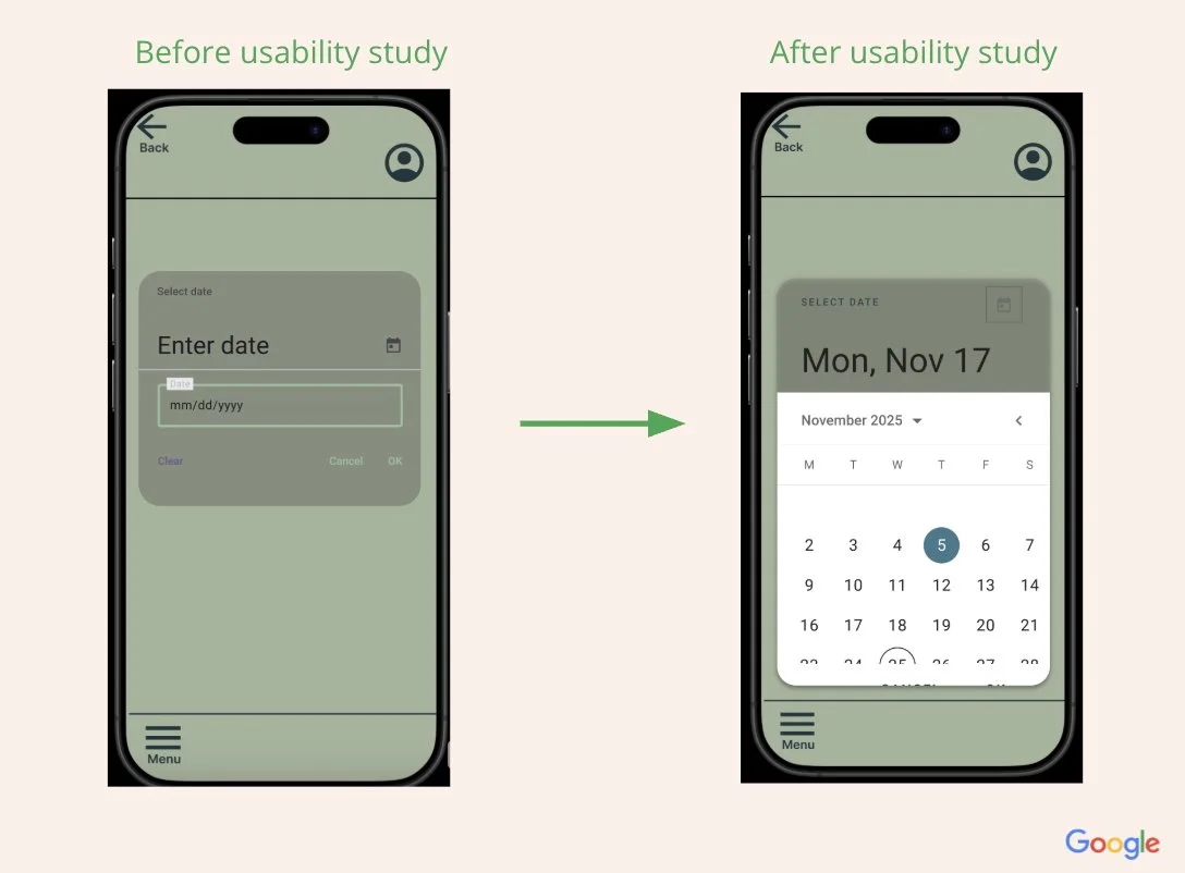
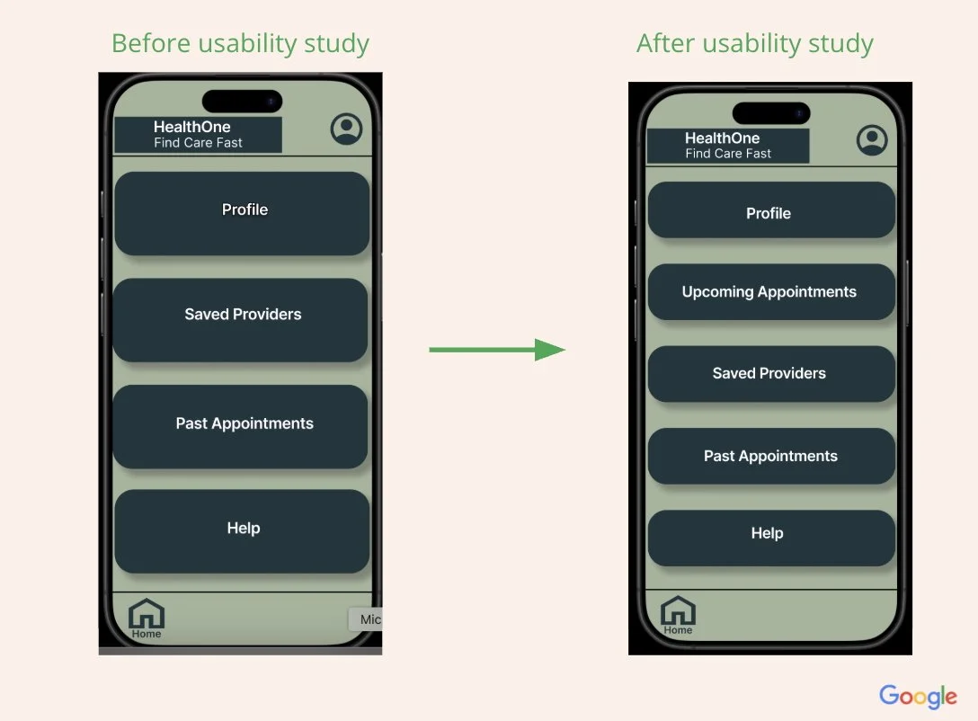
Feedback from the usability testing indicated two themes. Users wanted a more intuitive calendar to be able to more easily select dates displayed along with the day of the week. Another theme from users was a desire to access all appointments, both past and upcoming in order to more easily review them. I made two minor changes:
I incorporated a more intuitive calendar to be able to more easily select dates displayed along with the day of the week.
I added a tab within the main menu to review upcoming appointments or view past appointments.
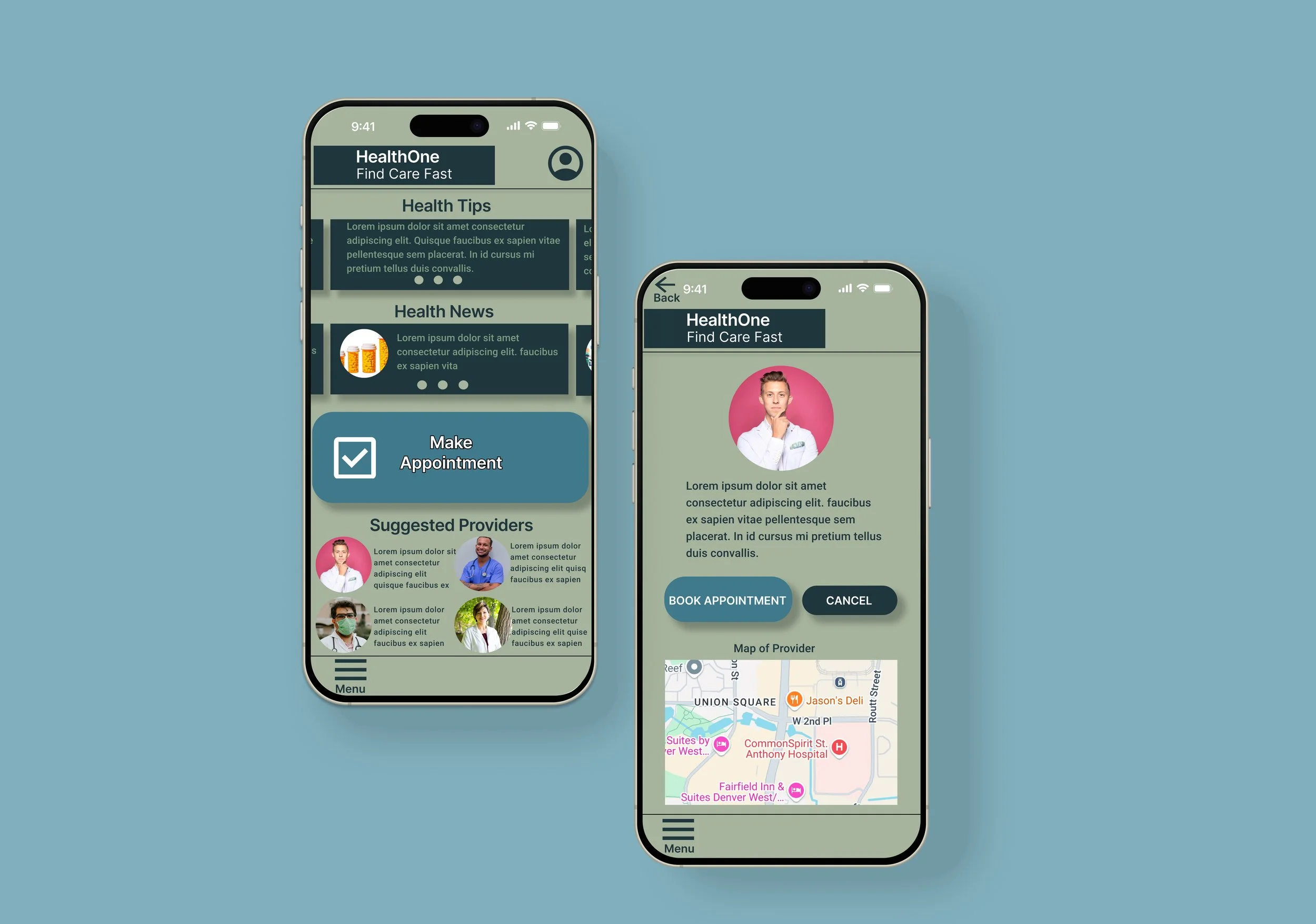
Final Designs
Product Successes
The app has provided a convenient, easy-to-use one-stop shop for users to find healthcare providers for a variety of services across insurance networks. This greatly expands access to needed healthcare services promptly and from the convenience of a mobile device. I’m looking forward to the expansion of the app’s reach with the development of a complementary responsive website.
Takeaways, Learnings and What’s Next
I learned with the HealthOne app to gather as much user feedback as possible in the early phases of the project. I started to gather feedback in the first few weeks, and many different user journeys became evident which informed the first design iterations. This provided important first-hand evidence for design decision-making.
©2025 Webmoor LTD. All rights reserved.