
Metro Museum Responsive Website and Mobile App
At-a-Glance
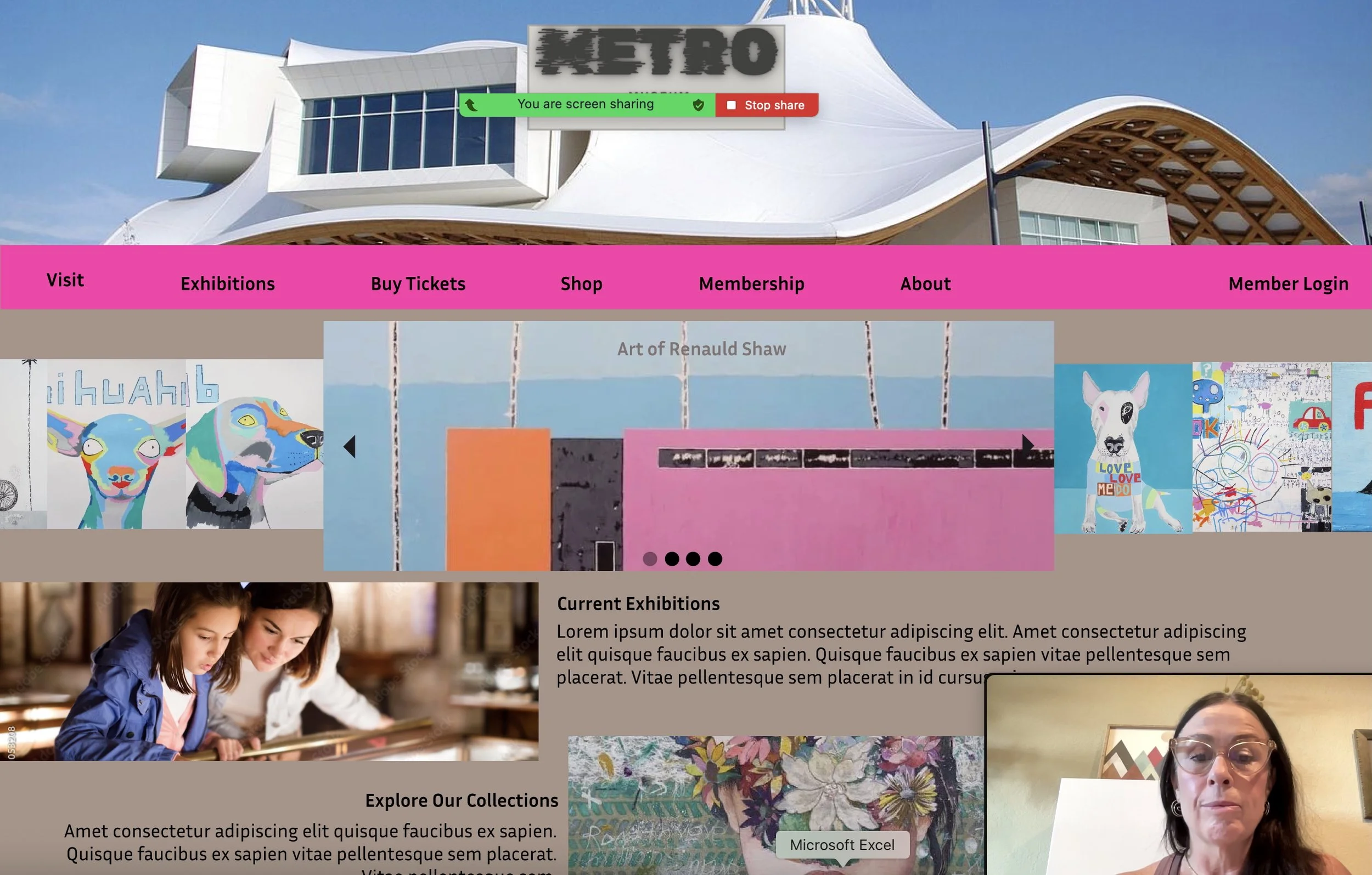
For the Google UX Design Professional Specialization, I worked for two months in 2025 designing a responsive website and mobile app. From a real-world design prompt, I worked to create from ground zero a new platform for a museum to attract a large, diverse target audience of users who wanted an engaging and easy-to-use platform to view the museum’s catalog, see current and upcoming exhibitions, and easily select and book tickets for visits. I delivered a complete set of web and mobile designs and a design system for the museum to increase user traffic and provide a digital storefront.
Timeline
2 months
My Role
UX Designer
Platform
Figma
The Problem
The Metro Museum in Camden Town London needs to completely update its old, non-responsive website. It has seen a fall in web traffic and in ticket sales for visiting its exhibitions. They also wanted to add an online shop where visitors can purchase items from a new museum product line. They contracted for a quick turnaround (two months) to develop a responsive website and app with new content to drive increased visitation to the museum and web traffic.
The Solution
I completed a full product development life-cycle, from background and generative user research, to ideation, brainstorming and prototyping, to usability testing, iteration and hand-off for launch. The responsive website and app featured all new content, greater showcasing of exhibitions, a streamlined process for purchasing tickets, and an integrated e-commerce museum shop.
Process
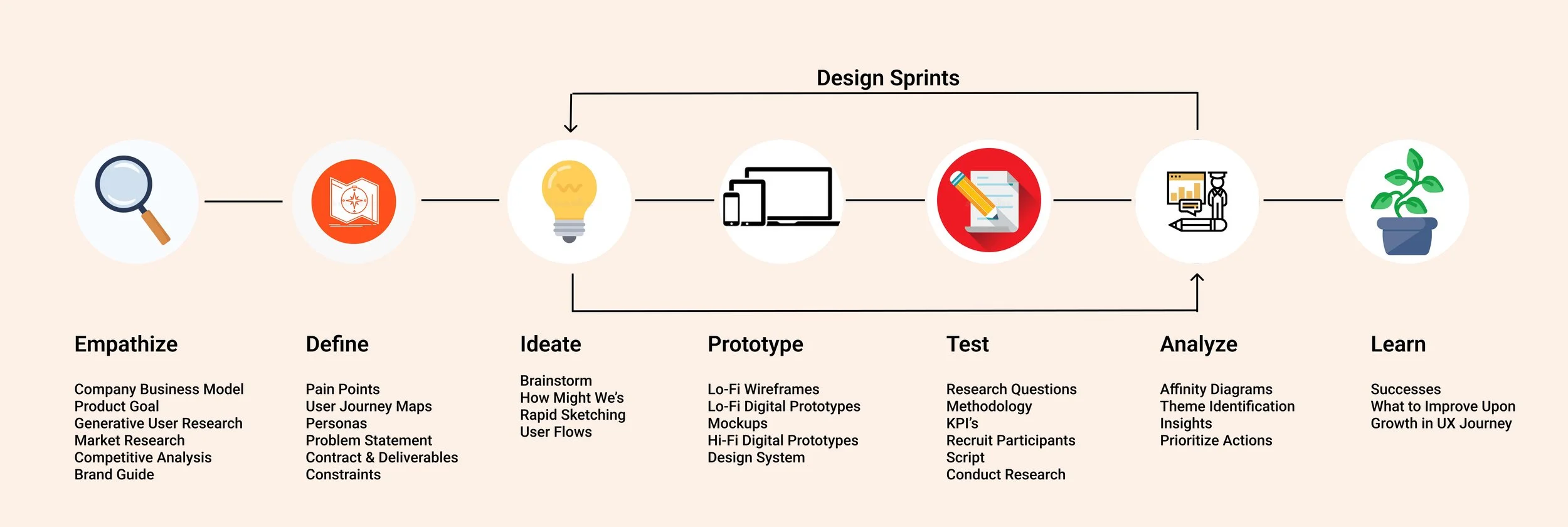

Persona

User Journey
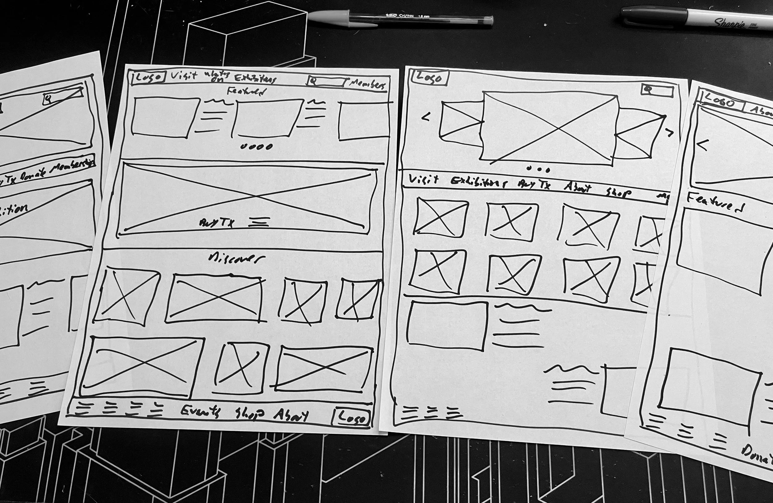
Ideate on Paper
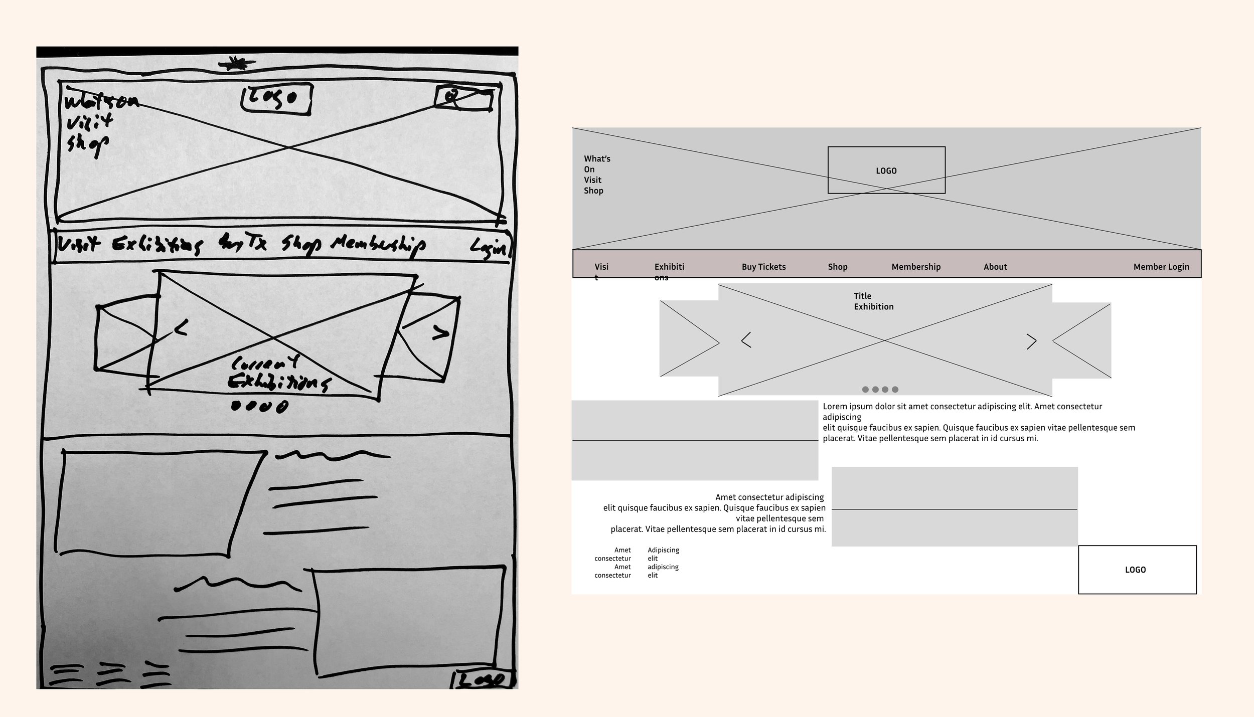
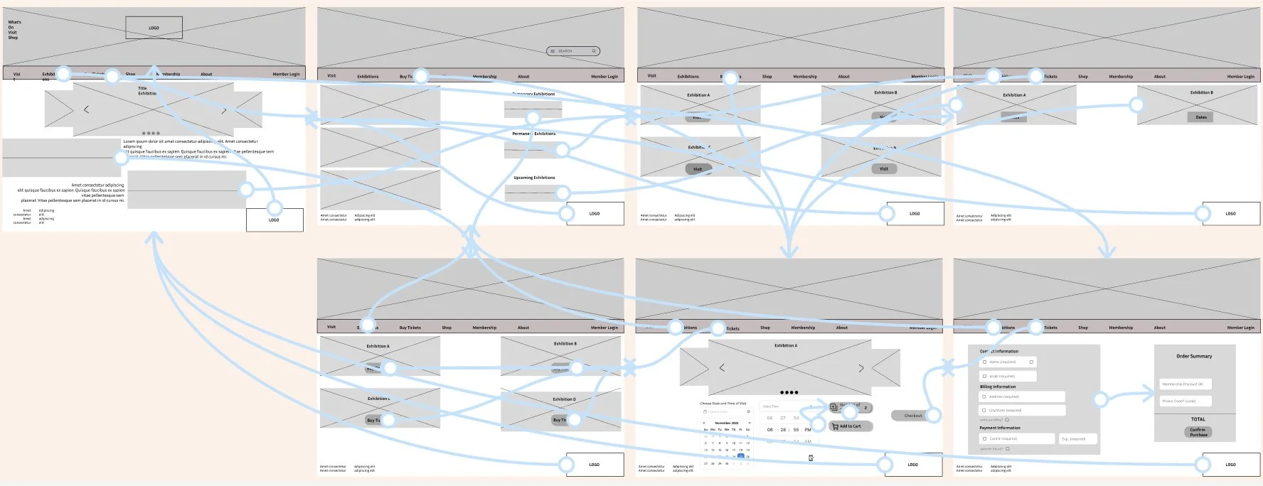
To Digital Wireframes
Lo-Fi Prototypes

User Testing
I recruited five participants for initial user testing, two men and three women ages 14-51. I conducted unmoderated testing using Zoom screen recording for analysis. I put the responses into buckets using Affinity Diagrams to identify key themes and develop actionable insights.

Iteration
I made three major changes based on user feedback.
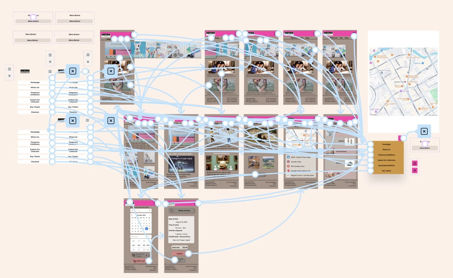
Pop-up, “hamburger menu” for the mobile app version
A new screen to review purchased tickets before booking
A dedicated Vist screen with detailed visiting information and an interactive, embedded map
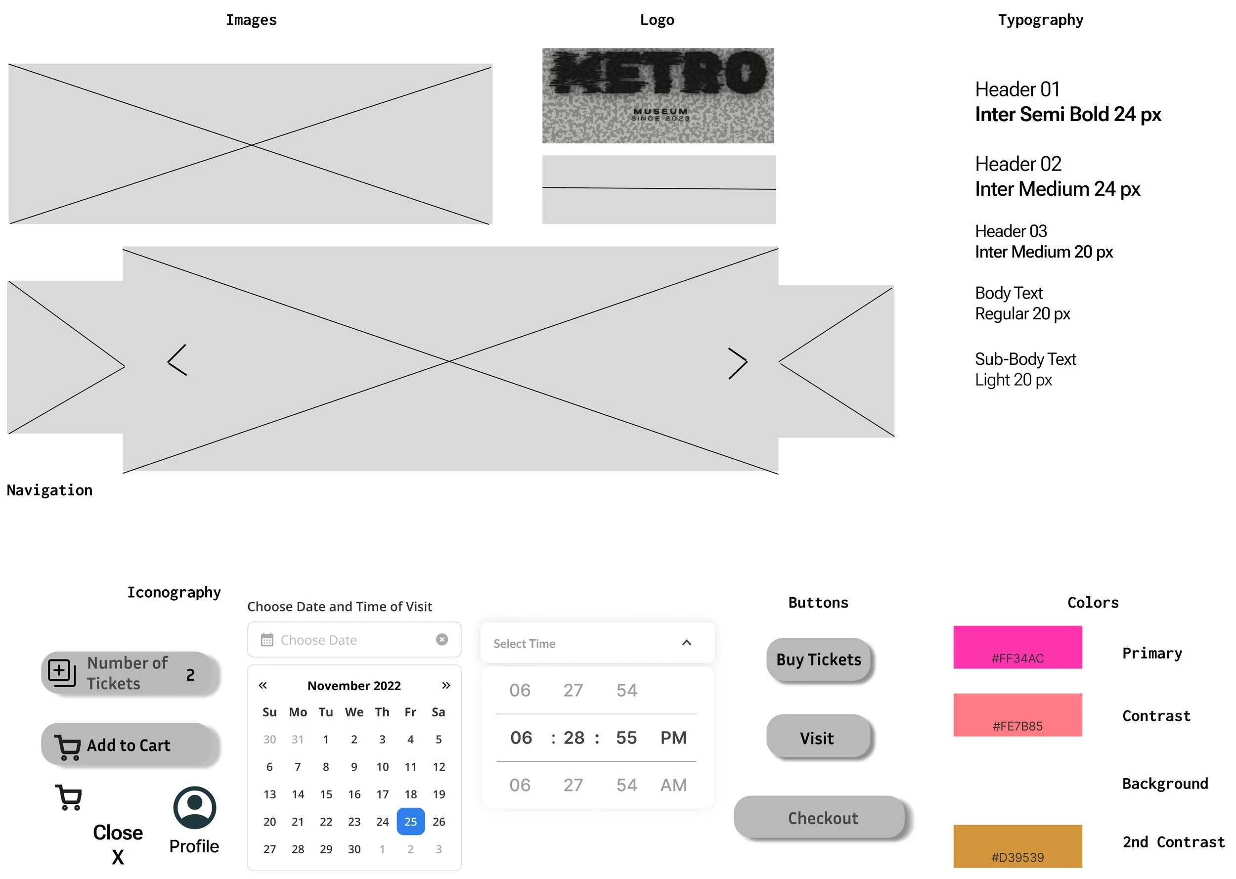
Design System
Hi-Fi Prototypes
Usability Testing
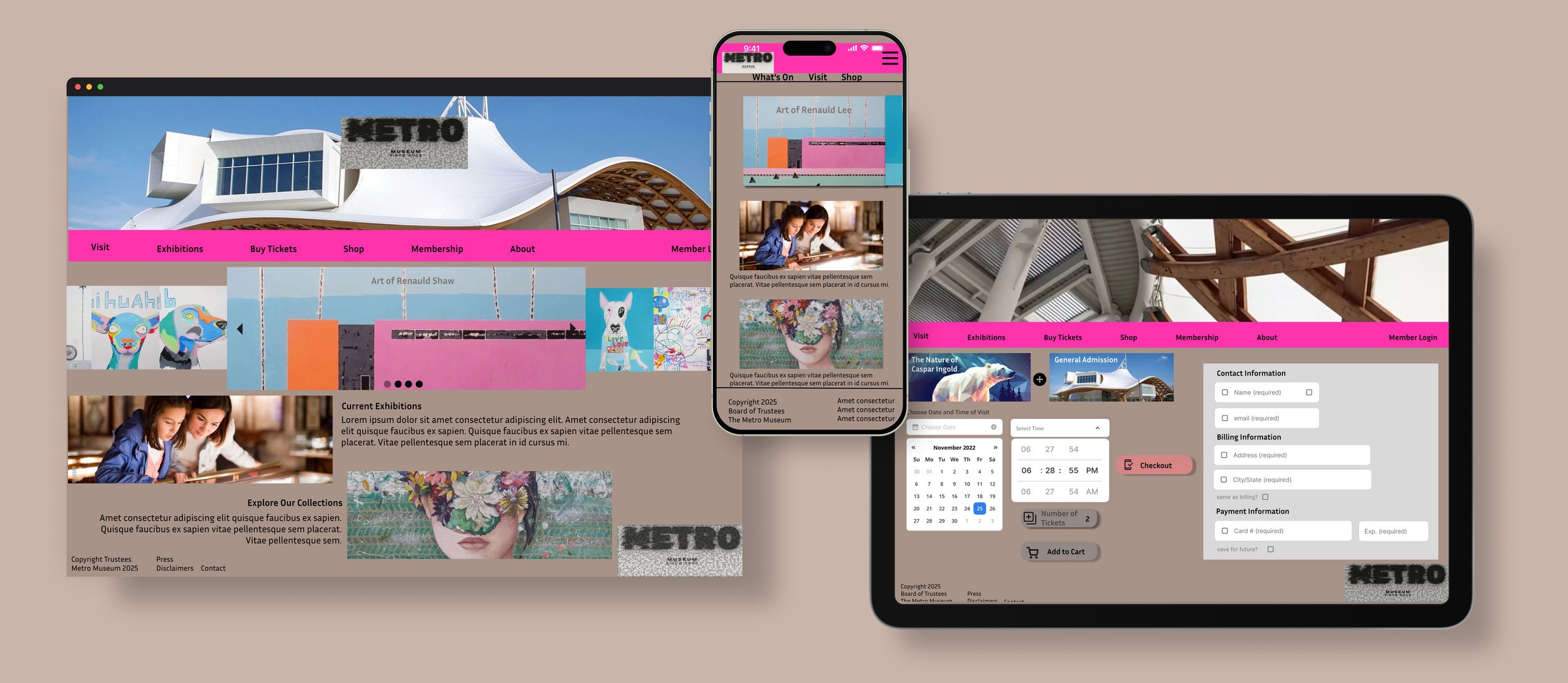
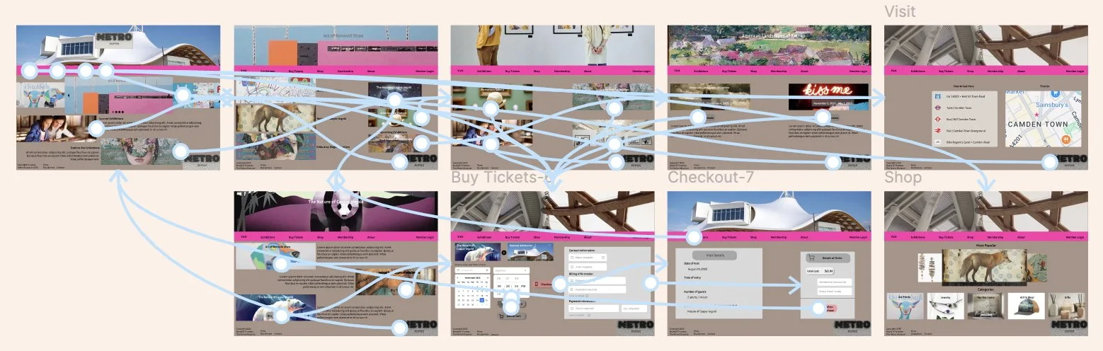
Final Designs

Product Successes
A jump in web traffic combined with increased in-person visits in first month after launch. The new store-front has generated the first mechandise orders for the museum, and it is planning to scale operations accordingly. “I really like that I can view the exhibitions and then go to the online shop and buy a print of one of my favorite paintings. I also like that I can buy gifts for my artsy friends.“
Takeaways, Learnings and What’s Next
Grew a lot on this one! The color palette and imagery-intensive design requested by the clients contrasted with my previous design work. And most importantly, my initial menu design for the mobile version was clunky and obtrusive to the user experience. I had to learn how to design a streamlined and minimalist version in Figma. Overall, I’m excited to see where museum visitation and merchandise shopping goes!
©2025 Webmoor LTD. All rights reserved.